
Author
Published
September 17, 2025
Reading time
5 min
Content
H2
Share
Looking for design support?
Hire top designers for a fixed monthly rate.
10 Best SaaS Pricing Page Examples
Choosing the right SaaS pricing page design can be a game-changer for conversions.
In 2024, SaaS companies are getting creative with how they present pricing information.
We’re seeing well-structured pricing plans with helpful features like plan comparisons, FAQs, testimonials, and other supportive materials to guide users in making informed decisions.
Our experts at magier know this best - they’ve designed thousands of SaaS pricing pages for well-known brands, and today, we’re excited to share some of them with you.
But before we go there, we’ll also share tips on creating a pricing page that drives conversions—based on real results from real clients.
Let’s go!
Designing a SaaS Pricing Page That Converts
Your SaaS pricing page isn’t just another section of your website. Instead, it’s a key touchpoint that can determine whether a visitor becomes a customer.
A good SaaS pricing page should simplify complex information. The spotlight should be on the pricing plans, and the more direct they are, the simpler it is for a customer to decide.
But what exactly goes into building a pricing page that resonates? Here are some elements to consider.
Clarity Above All
When it comes to pricing, clarity is important. Users want to understand the cost upfront, followed by all the features included, and how they compare for each plan.
Table formats work best for this purpose. Many brands also include dedicated plan comparisons to give users a deeper understanding of what to expect.
Visual Emphasis on Value
In some pricing plans, you might see labels like “most popular, or “recommended plan” next to certain options. This is a great strategy that guides users’ attention towards the plan that has the best value.
While they might seem like small touches, they have a big impact on a user’s decision-making process.
Additional Materials and FAQs
Sometimes, the specifics of each plan may need a bit more explaining. Tips, additional materials, and FAQs add value by offering additional context without cluttering the page.
This is especially useful for features that may be technical or niche.
At the same time, FAQ sections are common on brands’ pricing pages and build trust while answering common questions.
Trust Signals and Social Proof
83% of consumers indicate they prefer not to engage with brands they don’t trust. Users need a reason to rely on your brand, and adding testimonials, trust badges, or logos of well-known clients provides what’s called social proof.
Many SaaS companies integrate a "customer stories" section on the pricing page. They feature brief case studies or user testimonials.
Trust signals give you a sense of security about the product you’re thinking of purchasing. This is especially important if you’re new to the brand and are not convinced yet whether to purchase its plans.
Features for a Personalized Experience
Interactive pricing tools, like sliders, not only are a cool addition but also allow customers to see how the price changes based on their unique needs.
This personalization keeps users engaged and gives them an immediate sense of control, making them more likely to consider a purchase.
Clear and Actionable CTAs
Strong, clear CTAs (Call to Action) are a must. Whether it’s "Try it for Free," "Contact Sales," or "Book a Demo," these buttons guide users to the next step in the buying journey.
They are commonly placed within each pricing tier, and at the bottom of the page, to kind of guide users where to go next.
10 Best SaaS Pricing Page Examples
1. Zellify

Let’s kick things off with the first SaaS pricing page example, Zellify.
It’s simple and minimalistic, with three clear pricing options: Starting, Premium and Enterprise, with the first plan available for Free.
The clean layout makes it easy to check all the features and find the plan that suits you best. Also, the minimal use of color keeps the focus right where it should be - the prices and features.
If you’re still on the fence about making a decision, the “Feature Breakdown” section gives a side-by-side comparison of each plan for better clarity.
And at last, this pricing page wraps up with an FAQ section and a call to action to try the platform for free.
2. Tuple

When it comes to clean pricing page designs, Tuple is makes a great example. They’ve kept it simple with only two pricing options: Engineering Teams and Enterprises, which are listed in a neat table format.
The Engineering Teams plan is priced per user per month. It includes unlimited pairing sessions and the ability to pair with external collaborators for free—a huge advantage for teams working across different locations.
The Enterprises plan has custom pricing available. If you decide to purchase this plan, you’ll have to contact their sales team to get an offer.
But that’s not all. Tuple has a unique refund policy, “No love, no pay”, where they refund your most recent monthly payment if you’re unhappy with the results. A great strategy to build loyalty and increase the chances of expanding potential customers.
If you browse further, you’ll find testimonials from developers and frequently asked questions about the Tuple licence.
3. Payhawk
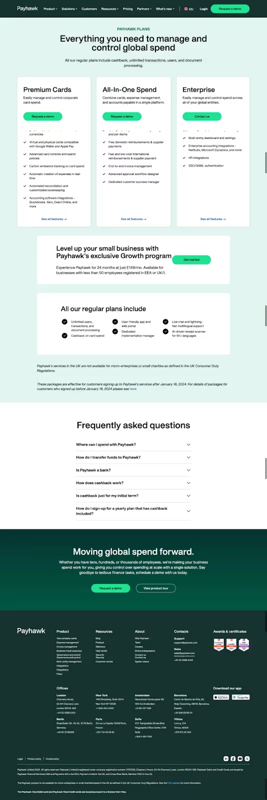
Payhawk’s pricing page is clear and easy to navigate, with three main plans structured in simple card-style layouts. While the prices are not displayed upfront, the “Request a demo” button in bold green immediately catches the eye as you land on this page.
Right below the main plans, you’ll find Payhawk's special Growth program, which is available for small businesses looking to level up.
The FAQ section at the bottom of the page addresses common questions, like those about using Payhawk, how cashback works and how to sign up.
Clear calls-to-action encourage visitors to request a demo or take a product tour to see how Payhawk can support their expense management.
4. Olvy

Now, let’s see a design that’s a bit more bold and dynamic.
Olvy’s pricing page isn’t shy about making an impact. Right away, you’ll notice the bold black and pink that contrast the light background and grab attention.
The three plans, Essentials, Business, and Enterprise, are presented in a table format with a modern layout that’s far from minimalistic.
The “Get Started” buttons are hard to miss, and the bold typography adds a modern, confident vibe to the layout. Other details like the pricing badges, and interactive buttons feel intentional, giving the whole page an energetic, approachable feel.
I especially love the large icons in front of each pricing plan, as it’s something we don’t see too often on SaaS websites.
And if you’re looking for more answers on the platform’s pricing plans, the FAQ section is just a scroll away. Plus, you can request a demo to see the platform in action with your own data.
5. VectorShift

VectorShift’s pricing page brings a bold, futuristic look with the use of black, blue and purple shades.
The pricing plans are designed for both individuals and organizations, and their features change according to which plan interests you.
If you’re an individual, you can choose from three options: Starter (free), Premium ($20), and Pro ($100). Switch over to “organizations,” and you’ll see tailored options like Team, Business, and Enterprise.
If you scroll down, a comparison table gives a clear look at the features in each plan, so it’s easy to see the differences. Next to it, the “Annual savings” toggle is a nice touch that lets you opt for a longer commitment at a discounted rate.
There’s also a helpful FAQ covering common questions about the platform and a “Get Started” CTA at the end that encourages users to try it for themselves.
6. Opus

On to the next SaaS pricing page example…Opus. It’s colorful, easy to navigate, and structured into card-like layouts.
There are only two pricing plans available: Growth and Custom, so, deciding on one that suits you best should be easier. Each plan has drop-down menus for “Usage,” “Platform,” and “Support,” giving a quick overview of what’s included.
If you’re interested in learning more, you can start a free trial with the Growth plan or book a demo for the Custom option. The page wraps up with a newsletter sign-up to keep you engaged with regular updates.
7. Supaglue
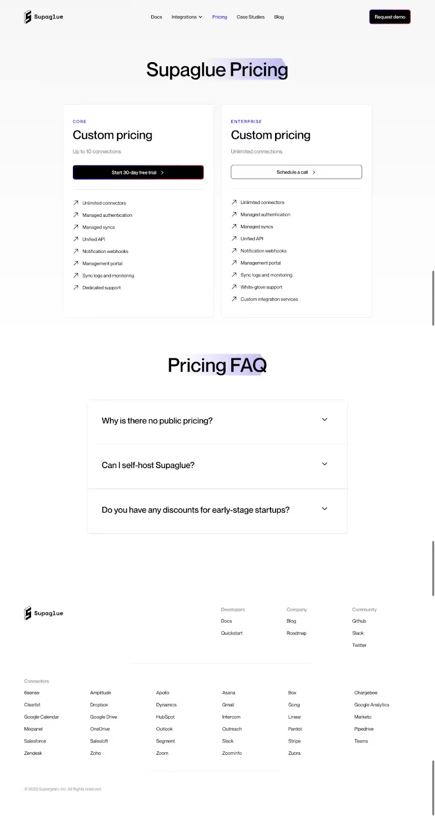
Supaglue has chosen a very minimal look on its pricing plans page. The classic black-and-white design with a subtle splash of purple emphasizes the product.
This clean layout keeps the focus on the essentials, the two main pricing options: Core and Enterprise, where the Core plan is designed for smaller teams and supports up to 10 connections.
For larger companies, the Enterprise plan provides unlimited connections and additional services.
The pricing plans follow with a FAQ section you can refer to find common questions.
8. Orum

Orum has a beautifully designed pricing plan with bold and modern colors that stand out in the featured dark background. The two main pricing plans are Launch and Ascend.
Launch is packed with more basic features, while Ascend targets larger organizations and comes with extra features. Through the “Find the plan that’s right for you” form, you can input your specific needs and get personalized pricing details.
There’s a strong focus on visuals, with high-impact stats like “5X increase in connects” displayed to showcase the brand’s value in productivity.
9. GSAP

GSAP’s pricing page, branded as "Join Club GSAP," has a modern, bold look that fits right in with the creative, developer-focused crowd.
I love the choice of colors here! The dark background makes the pricing colors pop, and there's a dynamic effect on each "Join" button: when you hover over it, the button fills with color.
There are four membership options you can choose from: GSAP Free for basic access, GSAP Plus at $99/year, GSAP Premium for $149/year, and GSAP Business at $199/year.
If you need a student licence or have questions about pricing, you can simply contact their team.
The page also features a detailed comparison chart that lets users see what’s included in each plan at a glance. For extra support, GSAP offers a money-back guarantee.
10. Whimsical

Whimsical’s pricing page is straightforward, with three clear pricing tiers —Free, Pro, and Org. The Free plan is great for solo users, while Pro and Org are designed for collaborative teams, with Pro starting at $10 per editor.
The dark purple background and gradient accents make the page visually engaging, and it goes well with the overall website aesthetic.
Their “Only pay for the editors you need” feature is a smart touch. It allows users to only pay for active editors, while viewers and guests are free.
For those still skeptical of purchasing a plan, Whimsical shares more about their commitment to security and compliance with GDPR, CCPA, and SOC 2, displayed in a dedicated “Safe and Secure” section.
The page also includes an FAQ section that addresses common questions, so you can find all the answers without leaving the page.
All in All
When it comes to SaaS pricing plan examples, the simpler they are, the easier it is for a potential customer to make a decision. While colors, buttons, and other features play a role in making the page more aesthetic and interactive, it’s also important to be mindful when using them.
In pricing plan pages, less is more. The goal is to guide the user toward taking action, which, in this case, is purchasing a plan without distractions.
That being said, we hope you found these SaaS pricing plan examples insightful and that they sparked some cool ideas for your future projects.
If you’re looking for similar pricing page designs for your website, our team at magier is always available to help!
FAQs
What are some key elements of a good SaaS pricing page example?
A good SaaS pricing page example should have clear pricing tiers, straightforward descriptions of each plan's features, easy-to-use comparison tools, and additional elements like FAQs and customer testimonials. All these components help users when deciding on which plan to choose.
What are some examples of effective SaaS pricing pages?
Some great SaaS pricing page examples mentioned in this blog post are Zellify, Whimsical, GSAP, VectorShift, Opus, etc.
How do trust signals and social proof impact a SaaS pricing page?
Trust signals, such as customer testimonials, logos of well-known clients, and trust badges, increase credibility. These elements make potential customers feel more secure and confident in choosing a plan, especially if they're new to the brand.
Marketing &
Design Newsletter
Design Newsletter
Subscribe to our newsletter and get cutting-edge marketing strategies, design inspiration, and exclusive tips delivered straight to your inbox.
